Persian Datepicker
A persian ( farsi ) datepicker for flutter.
Installation
Depend on it
dependencies:
  persian_datepicker: ^1.0.4
Install it
flutter packages get
Import it
import 'package:persian_datepicker/persian_datepicker.dart';
Usage
A simple example with a TextField which turns into a datepicker
یک مثال ساده با یک TextField که به عنوان دیت پیکر استفاده میشود
main.dart
import 'package:flutter/material.dart';
import 'package:persian_datepicker/persian_datepicker.dart';


void main() {
  runApp(Home());
}

class Home extends StatefulWidget {
  @override
  HomeState createState() {
    return new HomeState();
  }
}

class HomeState extends State<Home> {

  // our text controller
  final TextEditingController textEditingController = TextEditingController();

  PersianDatePickerWidget persianDatePicker;

  @override
  void initState() {


    /*Simple DatePicker*/
    persianDatePicker = PersianDatePicker(
      controller: textEditingController,
      datetime: '1397/06/09',
      outputFormat: 'YYYY/MM/DD',
    ).initialize();

    super.initState();
  }

  @override
  Widget build(BuildContext context) {
    return MaterialApp(
      home: Scaffold(
        appBar: AppBar(title: Text('تقویم ساده'),),
        body: Builder(builder: (BuildContext context) {


          return Container(
            child: TextField(
              onTap: () {
                FocusScope.of(context).requestFocus(new FocusNode()); // to prevent opening default keyboard
                showModalBottomSheet(
                    context: context,
                    builder: (BuildContext context) {
                      return persianDatePicker;
                    });
              },
              controller: textEditingController,
            ),
          );


        }),
      ),
    );
  }
}
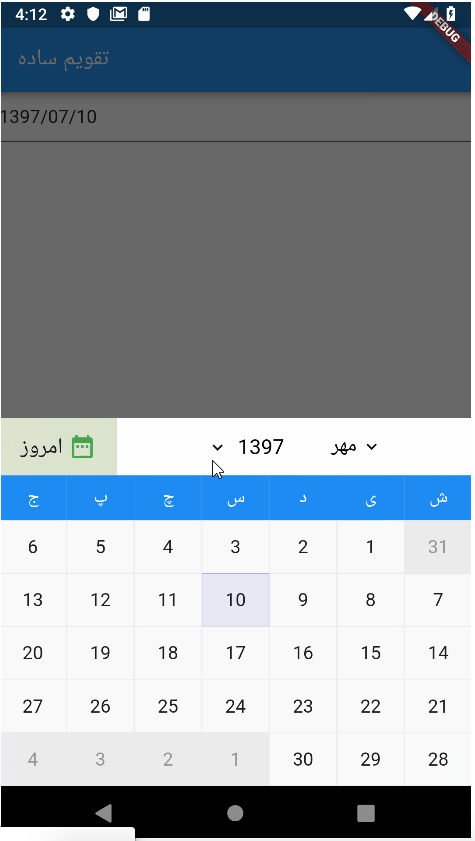
HOW IT LOOKS
Simple Datepicker دیت پیکر ساده

Datepicker with GREGORIAN input دیت پیکر با ورودی تاریخ میلادی
Datepicker will convert gregorian date to persian date first then set the TextField , then shows the widget ( if inline )
دیت پیتکر ابتدا تاریخ میلادی را به جلالی ( پارسی ) تغییر میدهد و سپس مقدار TextField را ست میکند
important note نکته مهم
if datetime is provided then the gregorianDatetime will be ignored. you can’t input two dates to a datepicker
اگر پارامتر datetime ست شده باشد آنگاه پارامتر gregorianDatetime نادیده گرفته میشود نمیتوان دو ورودی و تاریخ را به عنوان تاریخ شروع به دیت پیکر داد
/*DatePicker with gregorian date as input*/
persianDatePicker = PersianDatePicker(
  controller: textEditingController,
  gregorianDatetime: '2019-01-15',
  outputFormat: 'YYYY/MM/DD',
).initialize();
Range Datepicker دیت پیکر به صورت انتخاب محدوده
/*Range DatePicker*/
persianDatePicker = PersianDatePicker(
  controller: textEditingController,
  datetime: '1397/06/09',
  finishDatetime: '1397/06/15',
  outputFormat: 'YYYY/MM/DD',
).initialize();

Inline Datepicker دیت پیکر روی صفحه
/*Inline DatePicker*/
persianDatePicker = PersianDatePicker(
  controller: textEditingController,
  datetime: '1397/06/19',
  outputFormat: 'YYYY/MM/DD',
).initialize();


....


return Column(
  children: <Widget>[
    // Simple Date Picker
    Container(
      child: persianDatePicker, // just pass `persianDatePicker` variable as child with no ( )
    ),
    TextField(
      controller: textEditingController,
    ),
  ],
);

Customized Datepicker دیت پیکر شخصی سازی شده
You can customize datepicker as you wish, there are a lot of options to set, below example is just a few of them.
شما میتوانید دیت پیکرتان را به هر صورتی که میخواهید شخصی سازی کنید. در مثال زیر تنها بخشی از پارامترها آورده شده است
/*Customized DatePicker*/
persianDatePicker = PersianDatePicker(
    controller: textEditingController,
    outputFormat: 'YYYY/MM/DD',
    datetime: '1397/08/29',
    finishDatetime: '1397/08/30',
    daysBorderWidth: 3,
    weekCaptionsBackgroundColor: Colors.red,
    headerBackgroundColor: Colors.blue.withOpacity(0.5),
    headerTextStyle: TextStyle(color: Colors.blue, fontSize: 17),
    headerTodayText: Text('امروز', style: TextStyle(fontSize: 15),),
    headerTodayIcon: Icon(Icons.access_alarm, size: 15,),
    datePickerHeight: 280
).initialize();

Options
The controller of the input which you want to connect it to datepicker. This parameter is required
کنترلر تکست فیلدی که میخواهید به دیت پیکر تبدیل کنید
TextEditingController controller @requiredPersian input datetime
ورودی دیت پیکر به فرمت تاریخ پارسی
String datetime Default: today datePersian input finish datetime, if this option is set, then datepicker changes to range datepicker
ورودی دیت پیکر برای تاریخ پایان به فرمت پارسی، اگر این ورودی ست شود، دیت پیکر به صورت محدوده ای خواهد بود
String finishDatetime
Gregorian input datetime
ورودی دیت پیکر به فرمت تاریخ میلادی
String gregorianDatetime
Gregorian finish datetime, if this option is set, then datepicker changes to range datepicker
ورودی دیت پیکر برای تاریخ پایان به فرمت گرگورین، اگر این ورودی ست شود، دیت پیکر به صورت محدوده ای خواهد بود
String gregorianFinishDatetime
Output format of the datepicker ( display format ) فرمت خروجی نمایش تاریخ
- YYYY ( four digits year سال به صورت چهار رقمی )
- YY ( two digits year سال به صورت دو رقمی )
- MM ( 0 lead month ماه با صفر در ابتدای عددهای کمتر از 10 )
- M ( month number ماه بدون صفر در ابتدای عددهای کمتر از 10 )
- DD ( 0 lead day number روز با صفر در ابتدای اعداد کمتر از 10 )
- D ( day number روز بدون صفر در ابتدای اعداد کمتر از 10 )
String outputFormat Default: YYYY/MM/DD
Range output or input is two dates beside to each other with a separator between them which is rangeSeparator, default value is #
فرمت ورودی یا خروجی محدوده به صورت دو تاریخ کنار هم با یک جدا کننده است. این ورودی همان جدا کننده است که مقدار پیش فرض آن # میباشد
String rangeSeparator Default: #
The height of your datepicker
ارتفاع دیت پیکر
double datePickerHeight Default: 320
When you tap on the year caption, a tiny dialog appears with an animation, this option handles the Duration of appearing the dialog
زمانیکه روی عنوان سال کلیک میکنید، دیالوگ کوچکی ظاهر میشود، این ورودی مدت زمان ظاهر شدن دیالوگ را مشخص میکند
Duration yearSelectionAnimationDuration Default: 400 milliseconds
The year dialog box Curve type
نوع انیمیشن دیالوگ انتخاب سال
Curve yearSelectionAnimationCurve Default: elasticOut
When you tap on the month caption, a tiny dialog appears with an animation, this option handles the Duration of appearing the dialog
زمانیکه روی عنوان ماه کلیک میکنید، دیالوگ کوچکی ظاهر میشود، این ورودی مدت زمان ظاهر شدن دیالوگ را مشخص میکند
Duration monthSelectionAnimationDuration Default: 400 milliseconds
The month dialog box Curve type
نوع انیمیشن دیالوگ انتخاب ماه
Curve monthSelectionAnimationCurve
The background color of selected year in year-selection-dialog
**رنگ پس زمینه سال انتخاب شده در **دیالوگ انتخاب سال
Color yearSelectionBackgroundColor
Text style of year selection dialog box
استایل متن در دیالوگ انتخاب سال
TextStyle yearSelectionTextStyle
The background color of selected year in year selection dialog box
رنگ پس زمینه سال انتخاب شده در دیالوگ انتخاب سال
Color yearSelectionHighlightBackgroundColor
Text style of selected year in year selection dialog box
استایل متن سال انتخاب شده در دیالوگ انتخاب سال
TextStyle yearSelectionHighlightTextStyle
The background color of selected month in year-selection-dialog
**رنگ پس زمینه ماه انتخاب شده در **دیالوگ انتخاب ماه
Color monthSelectionBackgroundColor
Text style of month selection dialog box
استایل متن در دیالوگ انتخاب ماه
TextStyle monthSelectionTextStyle
The background color of selected month in month selection dialog box
رنگ پس زمینه ماه انتخاب شده در دیالوگ انتخاب ماه
Color monthSelectionHighlightBackgroundColor
Text style of selected month in month selection dialog box
استایل متن ماه انتخاب شده در دیالوگ انتخاب ماه
TextStyle monthSelectionHighlightTextStyle
Background color of week captions
رنگ پس زمینه عناوین هفته
Color weekCaptionsBackgroundColor
Text style of week captions
استایل متن عناوین هفته
TextStyle weekCaptionsTextStyle
Background color of header
رنگ پس زمینه هدر
Color headerBackgroundColor
Text style of header texts, The icons near header captions also take their effect by this option
استایل متن، ماه و سال هدر. آیکون های کنار ماه و سال هم از این پارامتر تاثیر میگیرند
TextStyle headerTextStyle
background color of days
رنگ پس زمینه روزها
Color daysBackgroundColor
Color daysFontColor
Color currentDayBackgroundColor
Color currentDayFontColor
Color selectedDayBackgroundColor
Color selectedDayFontColor
Color headerTodayBackgroundColor
Color disabledDayBackgroundColor
Color disabledDayFontColor
Text headerTodayText
Icon headerTodayIcon
Color daysBorderColor
Color selectedDayBorderColor
Color selectedDaysInnerBorderColor
Color todayBorderColor
double daysBorderWidth
Important Notes نکات مهم
rangeSeparator and your custom date separator should not be equal, otherwise datepicker will return null
مقدار ورودی rangeSeparator و جداکننده ای که برای فرمت خروجی انتخاب کرده اید نباید یکی باشند در این صورت دیت پیکر خروجی جداکننده های محدوده و خروجی مشابه هستند برمیگرداند
Examples
You can find the full example in the example directory
Credit (github url) : https://github.com/Ali-Azmoud/persian_datepicker
Next Article : https://flutterappdev.com/2019/01/15/messenger-clone/


